Visible Help Center

The Visible Help Center experience was difficult to navigate and visually misaligned with the rest of the Visible platform, and needed a rethink. There was also a desire from the business to reduce calls to their support line, and allow customers to diagnose and solve problems themselves.
Together with a UX architect, I designed a new platform that would allow users to simply search for articles and browse categories to find the answers they need most, while surfacing popular and relevant content onto the landing page.
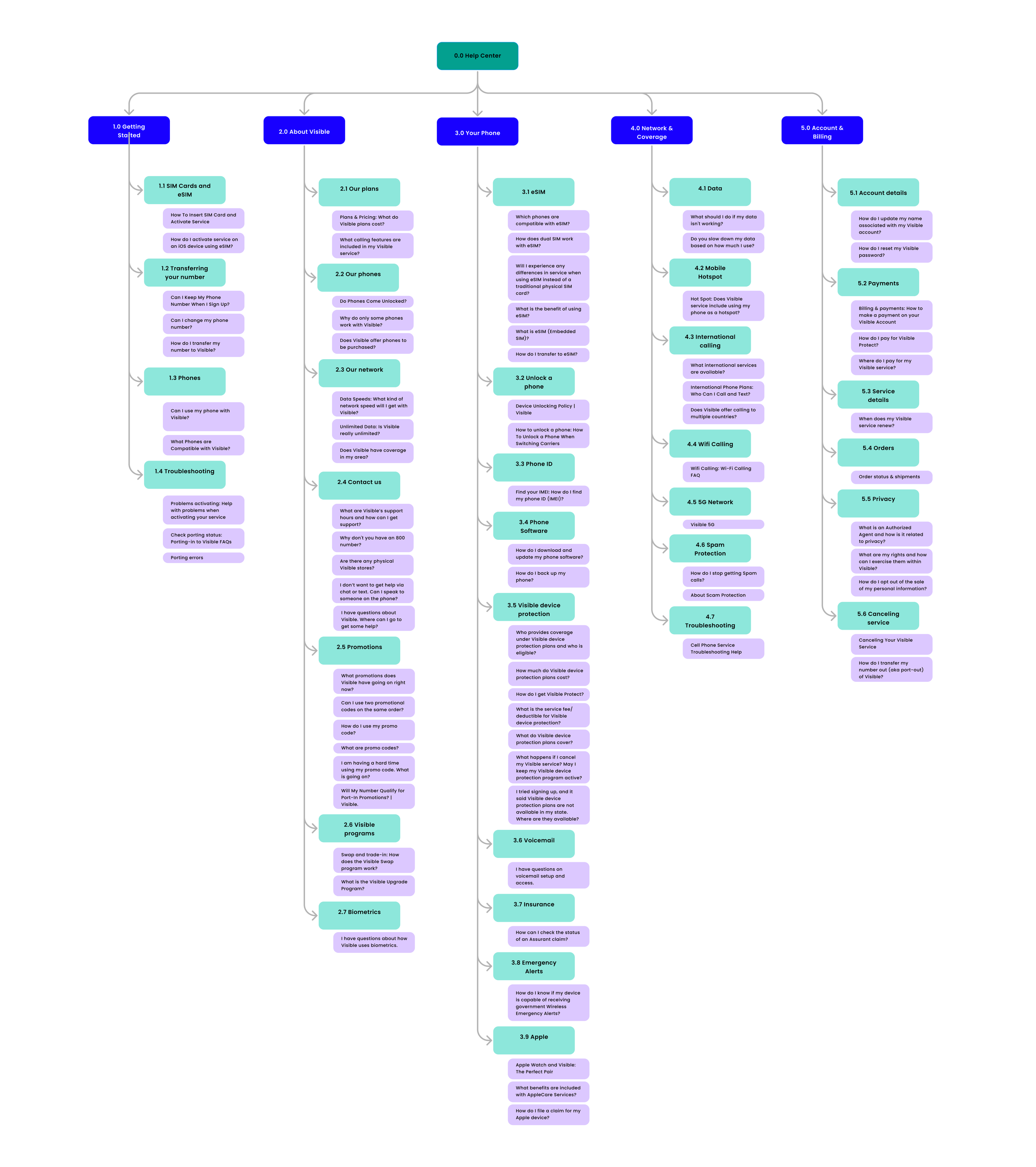
Information Architecture
We reviewed the current help center, improved its content, and created a new structure based on user needs. The content was simplified and rearranged to help users find information more easily, focusing on the most common questions and articles.
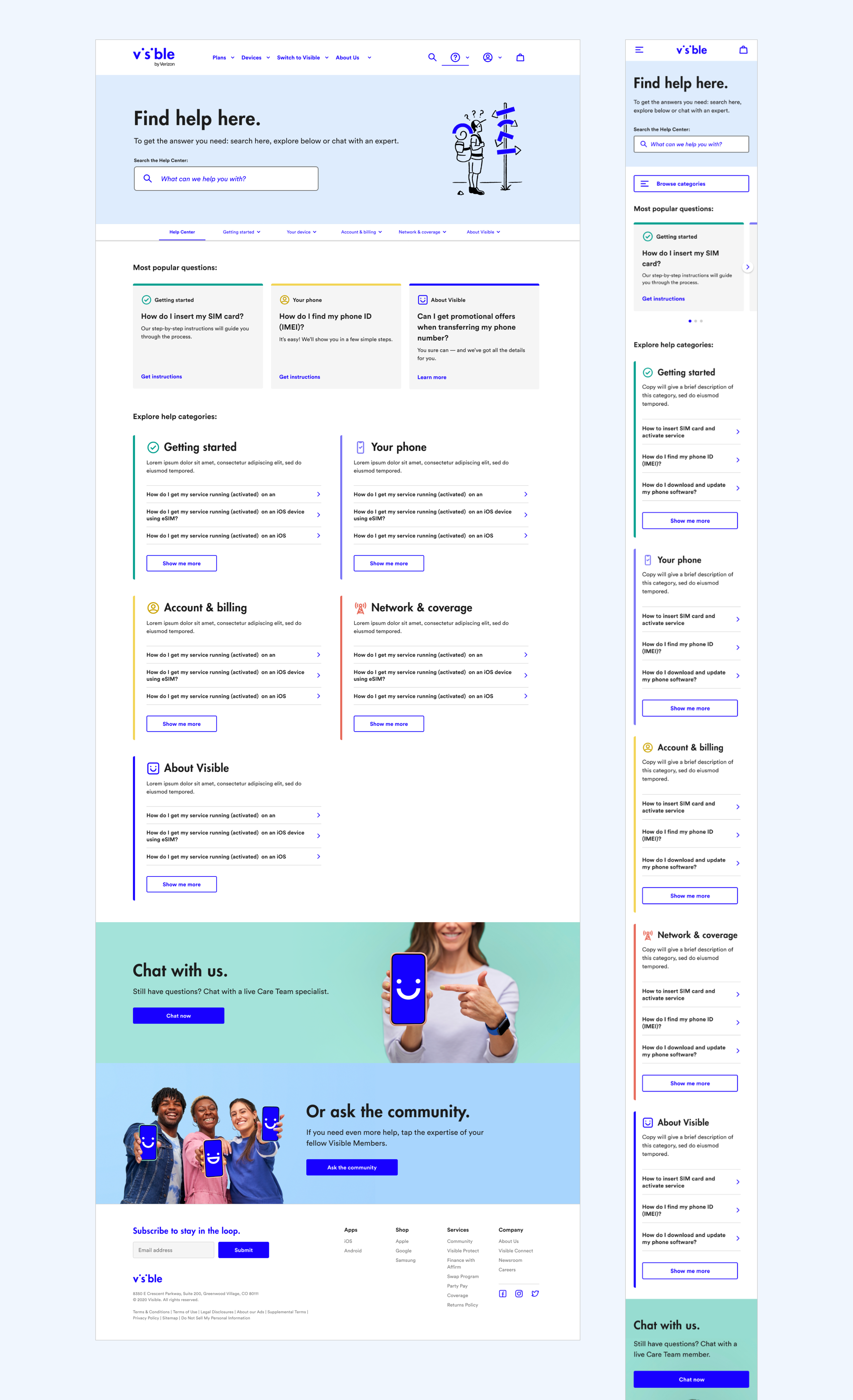
Landing Page
The Help Center landing page was given it’s own subtle visual branding to let customers know they are in a separate section of the Visible website. Key tasks a user needs to do are prioritized: searching for a specific issue or browsing the categories of the help center. Most popular questions were also surfaced at the top of the page for easy access. Each category was assigned a color and icon to allow for easy identification and orientation further into the help center.
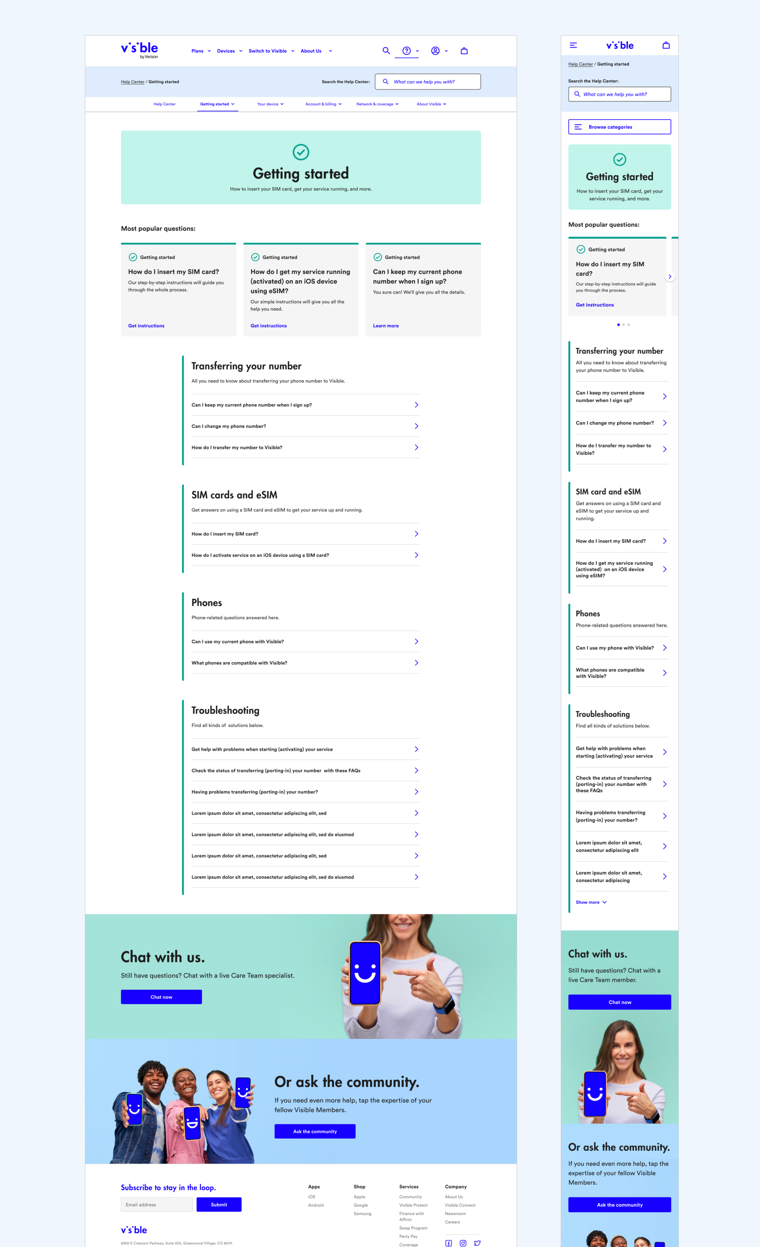
Category Pages
Category landing pages consistently use the color and icon introduced on the landing page, and are further divided into sub-categories, allowing the user to browse the content easily.
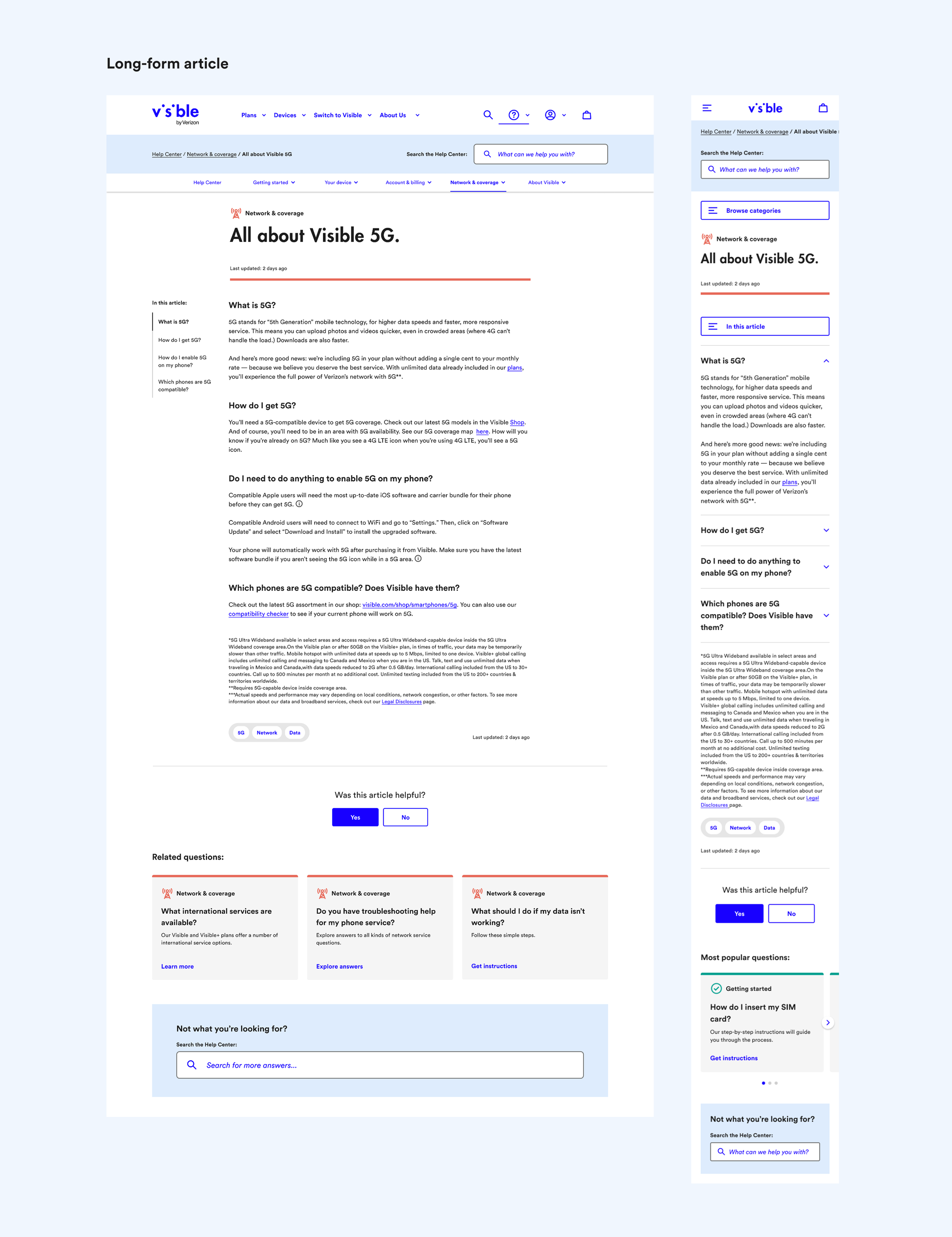
Arcticles
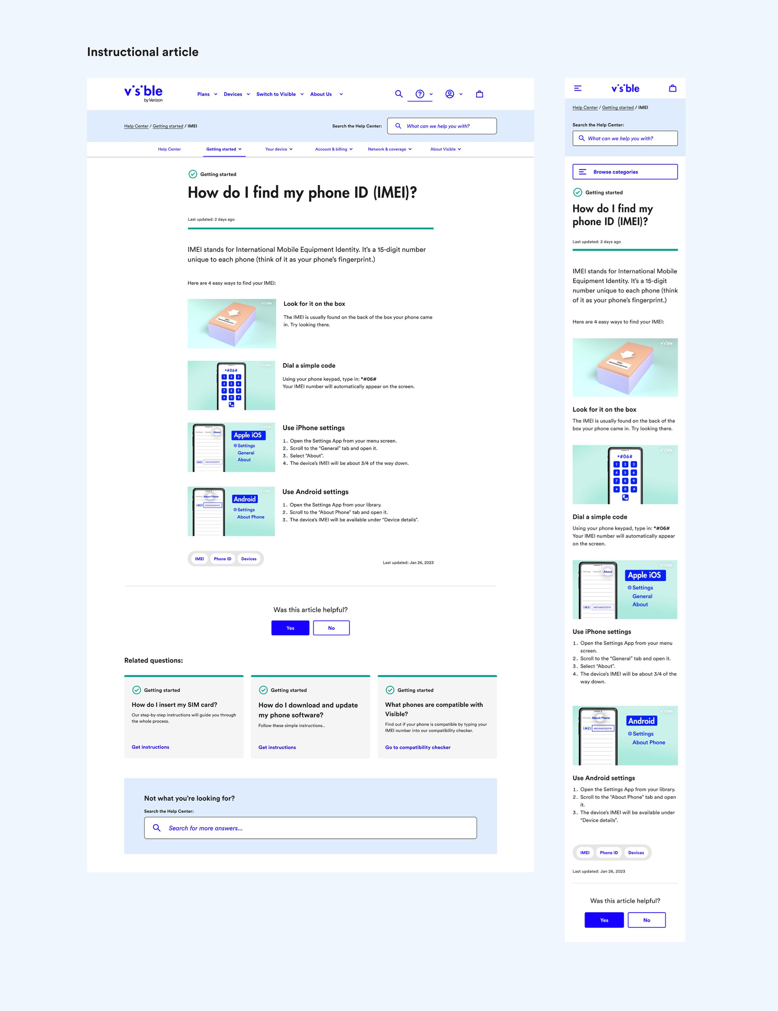
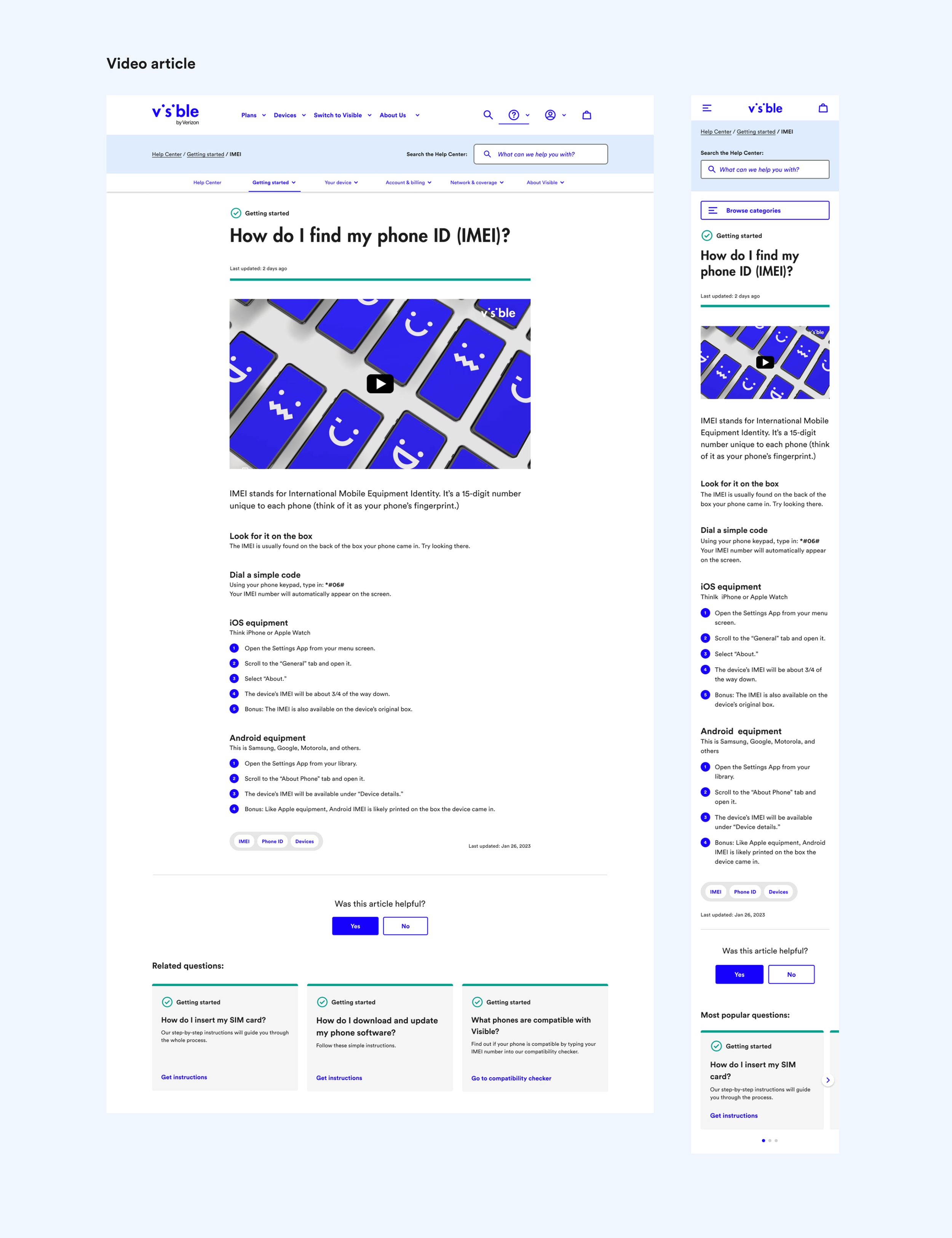
Article page templates were designed with specific content types in mind, and allow the author of each article to select the most suitable template for their needs. For example, a long-form article can utilize a template with a side-navigation bar, allowing users to easily jump between sections. An instructional article is suitable for a step-by-step guide, allowing the author to break down content into smaller segments with supporting imagery.
Navigating the Help Center
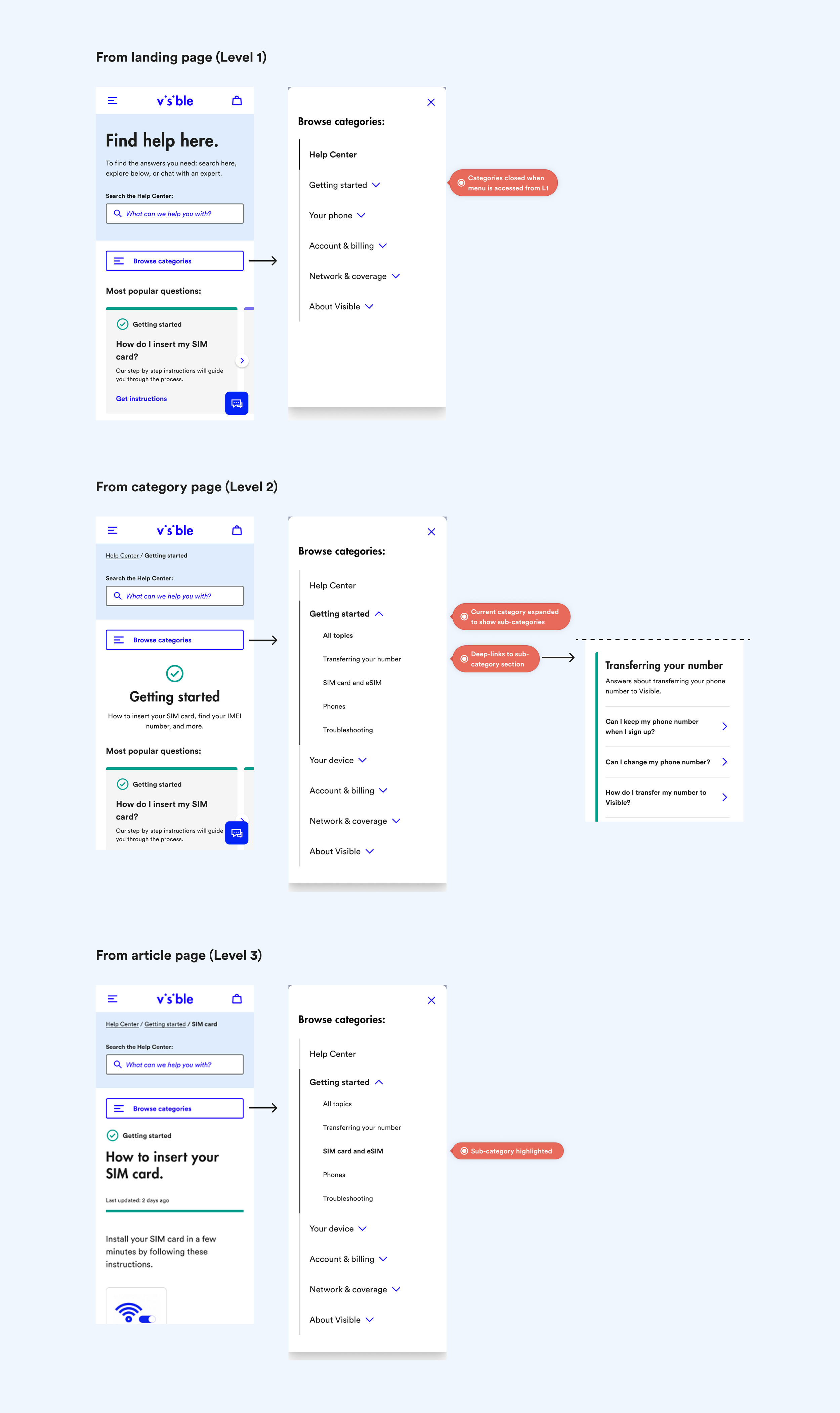
Category navigation allows the user to navigate within the help center, clearly indicating their current location, and let’s them expand categories and explore at sub-category level.
Category styles
Color-coding and iconography provides clear differentiation between categories and continuity throughout the experience.
